CSS RWD Media Queries
A media query uses the "@media" rule in CSS to add a certain rule and if proven true, will allow the web developers to automatically change the CSS styles of some of the elements in their webpage.
Example 1:
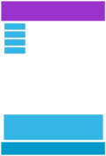
This is a simple example of a div element that changes its background color from purple to light purple when the screen width is less than 992px. Resize your browser window to see the effect:
Adding Breakpoints
Breakpoints are the required minimum or maximum pixel size we encode in our CSS media queries. In other words, this are the markers we will use to guide our website to change its CSS style whenever it is viewed on different devices such as phones, tablets, etc.

Desktop

Tablet

Smartphone
Typical Device Breakpoints
The following are the typical device breakpoints or pixel sizes for different media devices:
- Extra Small Devices (Phones) - less than or equal to 600px
- Small Devices (Tablets Portrait Mode, Large Phones) - more than 600px
- Medium Devices (Tablets Landscape Mode) - more than 768px
- Large Devices (Laptops/Desktops) - more than 992px
- Extra Large Devices (Large Laptops and Desktops) - more than 1200px
Example 2:
The div element below will change its text content when in different screen sizes. Resize your broswer window to see the effects.
You are viewing in a large laptop/desktop with more than 1200px screen width.
You are viewing in a laptop/desktop with more than 992px screen width.
You are viewing in a landscape tablet with more than 768px screen width.
You are viewing in a portrait tablet or large phone with more than 600px screen width.
You are viewing in a phone with less than 600px screen width.
Orientation: Portrait/Landscape
Other than the minimum and maximum pixel size values, we can use portrait or landscape values for our media queries. Portraits tells the media query that the viewport has a larger height than width while landscape tells otherwise.
Example 3:
The div element below will change background image when viewed from landscape to portrait. Resize to see the effects.
Hide Elements with Media Queries
We can also hide elements by setting the display of an element to "none" if a certain media query breakpoint is specified as true. We can also make font-sizes different for each media breakpoints.
Example 4:
Make this ghost disappear by resizing your browser size down to 992px!


